Long-Distance Relationship as College Student

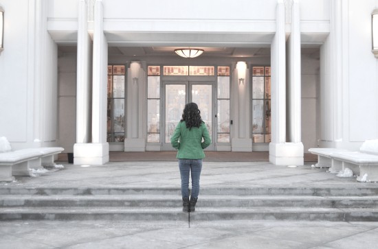
The dating culture at BYU-Idaho is an interesting beast. It is not uncommon to find a couple within 20 yards of oneself at all times. However, not all who are dating have the luxury of being with them on campus. This story explores one BYU-I student’s experience with her long-distance relationship.


Related Links

“What Every Person in a Long-Distance Relationship Should Know”

There is definitely a different dynamic to long-distance relationships than those in which both partners are in the same location. This article contains tips and life-hacks for couples navigating a long-distance relationship.

“6 Life Lessons Long-Distance Relationships Teach”

Long-distance relationships can be so tough, but it doesn’t have to all be bad. This article explains some interesting insights one can gain while in a long-distance relationship.


Behind the Scenes Story

I had the privilege of being with Sarah the night Brandon asked her on their first date. From that day on, I’ve been able to watch as they worked through their long-distance relationship. Because we share a room, I’ve been present for many of the  Skype calls, snaps, and phone conversations.  I have been able to see firsthand what it is like to be a college student in a long-distance relationship. As of now, I couldn’t be happier for the way things have worked out between them.

Terry Wilson

Terry Wilson only began working in ceramics a year and a half ago. Yet, whenever I talk to someone who works in the lab him him, they always go off about how skilled Terry is with pottery. Here, Terry explains a little bit about his thoughts on pottery and his success.

Portfolio


  • Project Corrections / Time spent: I spent two hours editing my projects.Flier: I got rid of my orphans, moved my text away from the edges (especially under leadership conference) and lined up the edges of my text.Event Ad: I added more red elements into my design to balance out my color scheme. To tie my elements together as well, I moved away from the boxes and made circles. (This one took the longest because I played with my color scheme as well)Letterhead: Lightened watermarkThe rest of my time was spent trying to figure out how make edits on my photoshop projects, but didn’t have enough time to make them once I started figuring things out.
  • Message:
    Basically all of my designs had this cute, millennial feminine feeling to them, so I felt like a calm neutral background with some swirly designs would at least connect with the feeling of most of my projects.
  • Audience: Potential employers.
  • Top Thing Learned: When you go to print the pages, make sure they are only one page design per actual paper, not two page designs connected on a single paper.
  • Future application of Visual Media: I am going to continue to use these skills throughout my life as I take photos, design fliers and invitations, and as I create my own portfolio/resume with my writing work instead of my design work.
  • Color scheme and color names: Primary Triadic, Yellow, red and blue
  • Title Font Name & Category: Alpaca, Sans serif
  • Copy Font Name & Category: It was an Oldface Serif
  • Thumbnails of Images used: My background is a colored rectangle shape with a texturizing feature in Adobe photoshop. The swirlies were created in Adobe Illustrator and then placed on top of the shape. Then I transferred my photoshop image to my master copy. So, I didn’t use any images from the Web.
  • Sources (Links to images on original websites / with title of site): Again, I didn’t use one in this project.


Project 7: Web page

P7JulieLeavittScreenshot

  1. Description: Web page explaining process of making my logo.
  2. Process (Programs, Tools, Skills): HTML, CSS, Adobe Photoshop, Adobe Illustrator
  3. Message: How I created my logo.
  4. Audience: Followers of my company.
  5. Top Thing Learned: The possibilities with web design are endless if I continue to learn about them.
  6. Color scheme and color hex(s): Triadic red: #BE1E2D; yellow: #E8D59A; blue: #1C75BC
  7. Title Font Families & Category: Serif
  8. Copy Font Families & Category: Sans-Serif
  9. Changes made to the CSS: Fonts, colors, paragraphs, lists.
  10. Word Count: Roughly 330

P6: Stationery Project

Letterhead

P6JulieLeavittLetterhead

Business card: 8.5×11 Layout

P6JulieLeavittcards

Business card: Large Layout

P6JulieLeavittLarge

  1. Description: This was a project I did to show my skills in using the Adobe Illustrator and InDesign programs. The point was to create stationery for a business by creating a business card and letterhead for them.
  2. Process (Programs, Tools, Skills):
    1. I began by brainstorming companies that I would like to create this stationery for. As I surfed the Internet and actually began designing for a different company, I had the thought to design stationery for a stationery design company and I fell in love with designing it.
    2. I actually began by creating my business cards in Adobe Illustrator first. I knew I wanted them to look like an old-fashioned envelope, and so I began there. I created the stripes by using the line tool, expanding the lines into objects and using the pathfinder tool.
    3. Then I had to put another rectangle inside of the outlined one.
    4. I placed my text and created the stamp. I used a bunch of little circles and the pathfinder tool to make the edges of the stamp serrated-like.
    5. I used the curvature tool to create the heart as the logo symbol.
    6. I created the elements in the letter head (mainly the ribbon at the top) in Illustrator again and then transferred it and the other elements over to InDesign.
    7. I focused on aligning all of my text with the lines and the logo on the outside edges of the page.
    8. I made my watermark logo blue with the opacity level in the teens. The logo, company name and my personal information all are the same size in at least height to add a sense of consistency throughout the design.
    9. My designs went through many critiques and opinions and I refined it into the final design.
  3. Message: I want to communicate to potential customers that I make creative, fun, classy, modern-vintage stationery.
  4. Audience: Women ages 18-28
  5. Top Thing Learned: Actually, the top thing I learned was the importance of grouping. Originally I had most of the contact information on the back, but to make it look more like a letter, I put the address on the front and left the rest on the back. However, it then became a game of searching to find the rest of the information. I learned that somehow, it all had to go together.
  6. Color scheme and color names: Triadic (Primary): Yellow, Blue and Red
  7. Title Font Name & Category: Always Forever Bold, Script-decorative
  8. Copy Font Name & Category: Century Gothic Regular (Bold for my name), Sans Serif

Project 5: Logo

JulieLeavitt-P5Logos

  1. Description: Demonstrate skills in Adobe Illustrator by creating logos.
  2. Process (Programs, Tools, Skills):
    1. I first sought inspiration through looking at other logo designs on the internet. I had three different things in mind when I came a cross a simple image of a leaf, and  because I love leaves, I knew that’s what I wanted in my logo design.
    2. I sketched out different styles of the logo and then began creating them in Adobe Illustrator.
    3. After quite a few audience votes and critiques, I narrowed my logo choice down to this one and began fine tuning it.
  3. Message: I want to communicate that the Little Leaf Boutique has a kind of earthy, boho, simple charm and classiness to its products. I see this logo not only on the store sign and on advertisements, but also on item tags and whatnot.
  4. Audience: I am trying to reach an audience of women ages 20-25 who are into earthy, boho and stylish accessories and whatnot.
  5. Top Thing Learned: The top things I learned were to make the design one that can be easily recognized and read depending on the size and that less is more in terms of decoration and design. I had to “kill many of my darlings.”
  6. Color Scheme and Color Names: Lime Monochromatic
  7. Title / Body Font Names & Categories: Sukhumvut Set (Text),  light Sans serif
    1. The “text” weight was used for “little leaf,” and the “light” weight was used for “BOUTIQUE.”

Project 4: Montage

P4JulieLeavitt

  1. Description:Create an inspirational montage using multiple images, masks, a filter and appropriate typography using Adobe Photoshop.
  2. Process (Programs, Tools, Skills, Steps taken while designing):
    1. I found my first image and set it as the background.
    2. I found my second image and used the lasso tool to select the tree with the sun shining through the branches and placed it on top of the background layer and added a layer mask.
    3. Using black paint, and a medium sized brush with 100% opacity, I cleaned away the edges of the image selection and then lowered my opacity level and brush size to softly blend the two images together. (My favorite part was blending the suns in the images together).
    4. I duplicated the background layer and moved the image to the right to cover up the logo in the top right corner. I then created a layer mask and used a large brush at 100% opacity and black paint to uncover the underlying layers. The closer I got to the logo, the softer I blended the images together, which didn’t require too much change in opacity or brush size because the images were essentially the same color.
    5. I created my text and pulled colors from the sun in the image for my text color.
    6. I then created my rectangle with a smart filter to go behind my text.
  3. Message: I want to convey a message of hope to anyone who feels like they don’t have any left. I want them to feel like there will be  light again in their lives and that this dark period they are experiencing will come to an end.
  4. Audience: Anyone who is feeling lost or like there is no hope in their circumstances.
  5. Top Thing Learned: How to use the layer masking tool effectively.
  6. Filter / Colorization used and where it was applied: I used the Smart Filter Grain filter in the box beneath my text. I pulled the blue color from the sky to keep it from distracting too much from the rest of the desingn.
  7. Color scheme and color names: Complementary Blue and Orange. I think the text may have ended up a little too yellow to be considered orange though. 
  8. Title Font Name & Category: Champagne & Limousines Regular: Sans Serif
  9. Copy Font Name & Category: Champagne & Limousines Bold: Sans Serif
  10. Thumbnails of Images used:tree1 370570-dusk
  11. Sources (Links to images on original websites / with title of site):
    1. http://www.magic4walls.com/wallpaper/landscape-nature-lonely-tree-beautiful-scene-magical-sunrise-grass-field-landscape-nature-solitary-tree-a-beautiful-scene-a-magical-sunrise-grass-field-16966.html Magic 4 Walls
      1. (This is the image I used, it’s from the site, but a larger version) http://www.magic4walls.com/wp-content/uploads/2013/12/landscape-nature-lonely-tree-beautiful-scene-magical-sunrise-grass-field-landscape-nature-solitary-tree-a-beautiful-scene-a-magical-sunrise-grass-field.jpg
    2. http://tophdimgs.com/370570-dusk.html Top Wallpapers

Project 3: Photo Design

P3-JulieLeavitt

  1. Description: Project demonstrating skills using Photography and the Adobe Photoshop program
  2. Process (Programs, Tools, Skills, FOCUS principles): Using a Nikon 3100, I shot my photo just around 5:30 p.m. I used Photoshop to adjust the  vibrance, brightness/contrast, and hue and saturation levels. I also used the sharpening tool around my subject’s face and hair. In regards to the image, I really focused on following the rule of thirds. To get my color scheme to work with the one present in the photo, I had to add a little bit of gray to my brick color. I also downloaded my fonts to help my text communicate the message in the right way.
  3. Message: I want to communicate to my audience a message to improve their sense of self-worth that reminds them they can be happy and confident with who they are.
  4. Audience: Women ages 18-23
  5. Top Thing Learned: I learned to make sure the image is in focus. I had another image that I really wanted to use, but it wasn’t in focus, so I had to change everything about my design. Also, I went out to take my image first (won’t do that again). It would have been better to have chosen my color scheme first, but I didn’t have any ideas, so I just went out. They did start coming once I got out there, but I didn’t have enough time to make it as good as I could have if I went into the shoot more prepared. In the future I think I’ll take the camera out before I do my actual shoot so I can ignite my creative spark and be prepared for the final shoot.
  6. Color scheme and color names: Brick and Teal: Complementary
  7. Title Font Name & Category: KG Eyes Wide Open Regular, Script
  8. Copy Font Name & Category: Caviar Dreams Bold
  9. Thumbnail of original, unedited image insertedDSC_0463
  10. Date and location you took the photo(s) Feb 2 at the BYU-Idaho Ricks Gardens

Project 3: Photography


JulieLeavitt-01-Light-Outside

Light 1: Outside

JulieLeavitt-02-Light-Inside

Light 2: Inside


Julie-Leavitt-02-Foreground-Focus

Focus 1: Foreground

JulieLeavitt-04-Background-Focus

Focus 2: Background

JulieLeaviit-05-Plan the Composition

Composition 1: Thirds

JulieLeavitt-05-Lead-Room

Composition 2: Lead Room


Well, this photography project was a little harder (and colder) than I expected. My favorite shots to capture were the focus ones, namely the one with the model looking at the Temple. I tried doing a photo like that before, but was unable to make it work. So I liked how this turned out.

I also enjoyed learning how to better use the Photoshop Program. It was fun to watch my images change as I worked with the different tools and added different layers. I am looking forward to further developing my skills with photography though.

Project 2: Event Ad

P2JulieLeavitt

  1. Description: A full-bleed color fundraising flier I created using Microsoft Word and a scanner.
  2. Process (Programs, Tools, Skills, FOCUS principles): I created this flier using Microsoft Word. After changing my margins to Narrow, I inserted the scanned image and used a filter to recolor the image. I used the color grabbing tool to match the colors of my shapes and text  directly with those on the color wheel.  I ended up focusing on the principle of simplifying as I eliminated unnecessary design elements such as extra lines and boxes.
  3. Message: I want to inform my audience of an upcoming fundraiser for a girl in the community who is having surgery. I want them to know who the benefactor is, and what they are doing to raise money for the beneficiary. I also want them to understand how much money is expected, so they can know what to expect when they arrive.
  4. Audience: Community members, adults ages 25-50
  5. Color scheme and color names: Monochromatic Lime. I chose lime because it gave the flier more of a summertime feel (the red I tried gave it a Christmastime feel).
  6. Top Thing Learned: I learned to respect the color wheel and follow it.
  7. Title Font Name & Category: Bangla Sangam MN, Sans Serif
  8. Copy Font Name & Category: Athelas Regular, Oldstyle Serif
  9. Scanned images used, sources, original sizes, location of scanner used:  
    Image Original Size: Width 8 in, Height 6 in
    Utah Valley Magazine
    Spori Scanner Epson Perfection V500 Photo